In Defense of Airbnb’s New Logo
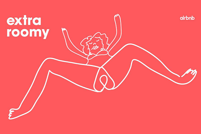
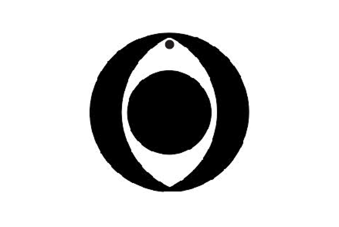
Airbnb’s new logo looks like a vagina. Or balls. Or just about any combination of sex organs. When the company announced an identity redesign, most people said, “Hey, genitalia!” A flurry of tweets, clickbait, and listicles ensued. In the first wave, pundits argued whether the logo did, in fact, resemble a vagina. Tweens squinted and asked what does that mean, anyway. The dust settled, all concerned agreed that yes, Houston, we have a vagina, (or penis, or #clitballs) and the second wave of social media bubbled up: was this buzz good or bad for Airbnb?

@khoi Nike has the Swoosh, Airbnb has the Clitballs.
— Adam Lisagor (@lonelysandwich) July 16, 2014
We’re not here to talk about good or bad. The one thing that everyone can agree on is that people can’t stop talking about Airbnb’s new logo and the genitals it may or may not contain. Now, Airbnb can continue to be the butt of all internet design humor, change the logo, or do whatever else they want. We just wanted to defend them, because, apparently, they aren’t going to adequately defend themselves.
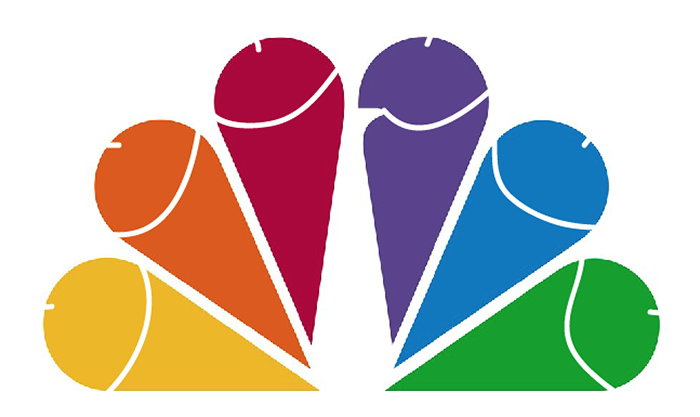
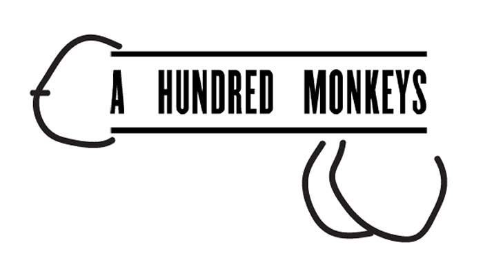
The thing is, tons of logos look like genitalia. With a simple curved line or two, many of the world’s most iconic logos can be turned into a glaring set of balls that sear your retinas. Hell, you don’t even have to do anything to the Chili’s logo. It’s a basic, lizard brain response. The good thing is, although dick jokes are easy (and funny), they die pretty quickly. So while Airbnb is weathering a storm of genitalia, they might want to remind people that dick jokes are a dime a dozen and you can turn just about any logo you want into a penis or vagina.


